Challenge
In a market where there was a lack of a brand that would lead the way in consumers' minds, we were given the challenge of building a brand narrative that would differentiate and popularize an unknown segment, creating a brand with a clear value proposition.

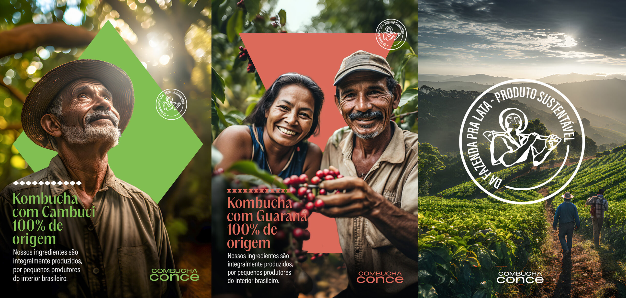
The essence of
Brazil in a can
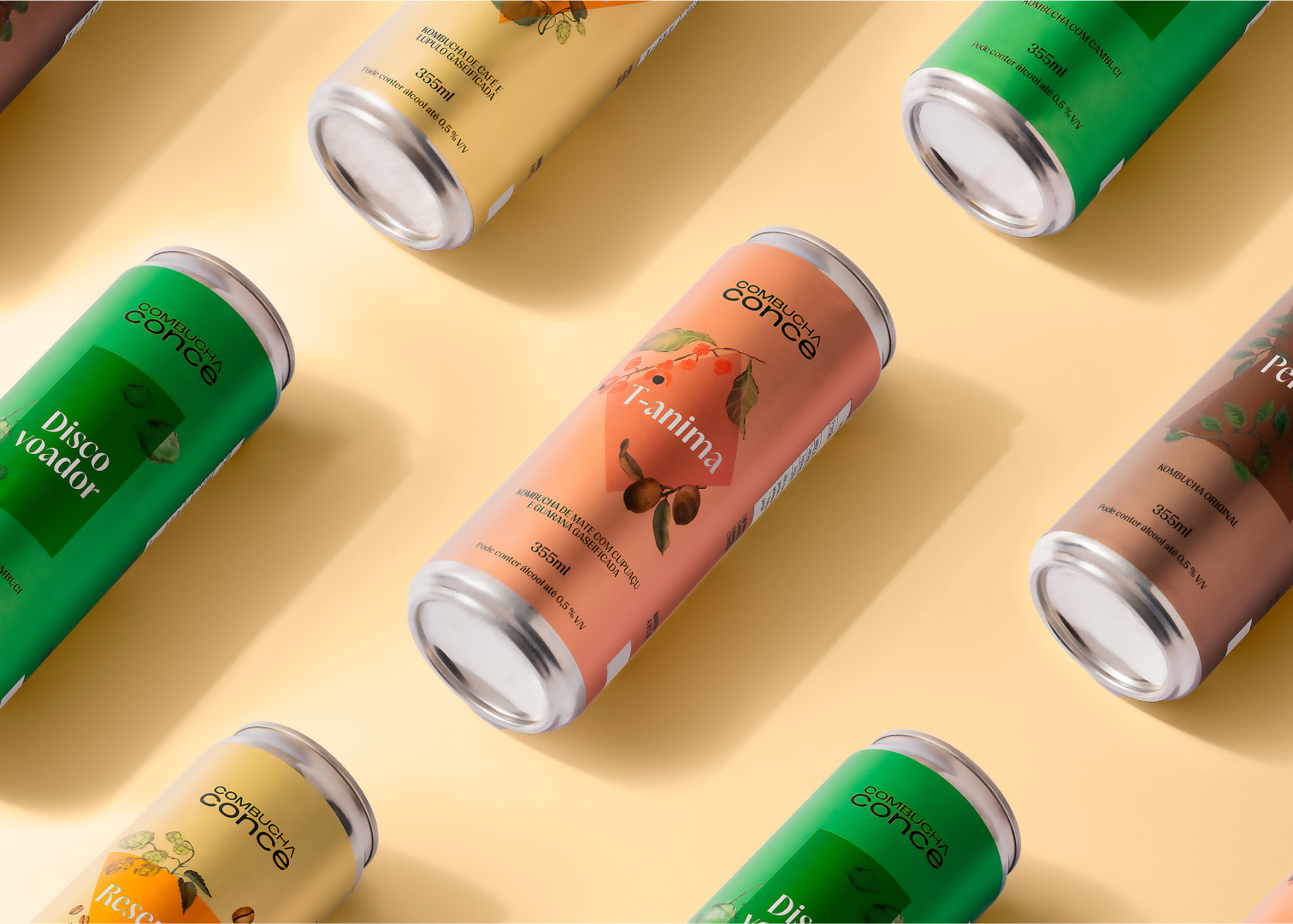
We have united a triad that celebrates love for Brazilian origins and roots, the present as an opportunity to celebrate and care for life and the planet.
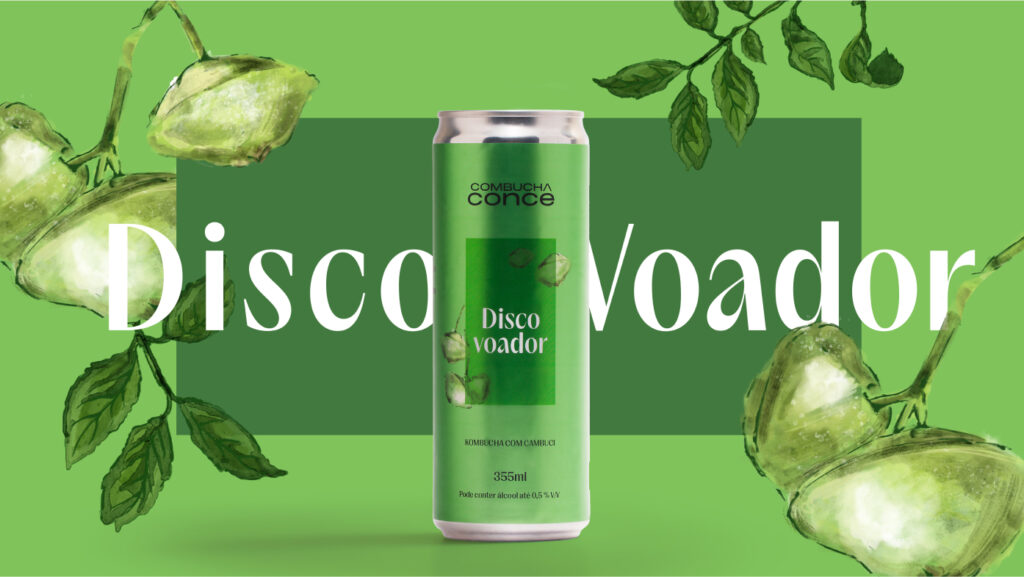
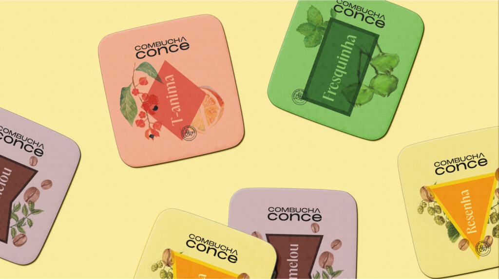
The colors are based on attributes of historic houses in small Brazilian towns, bringing a direct reference to inland Brazil.
Simplicity of soul,
Sophisticated flavors.
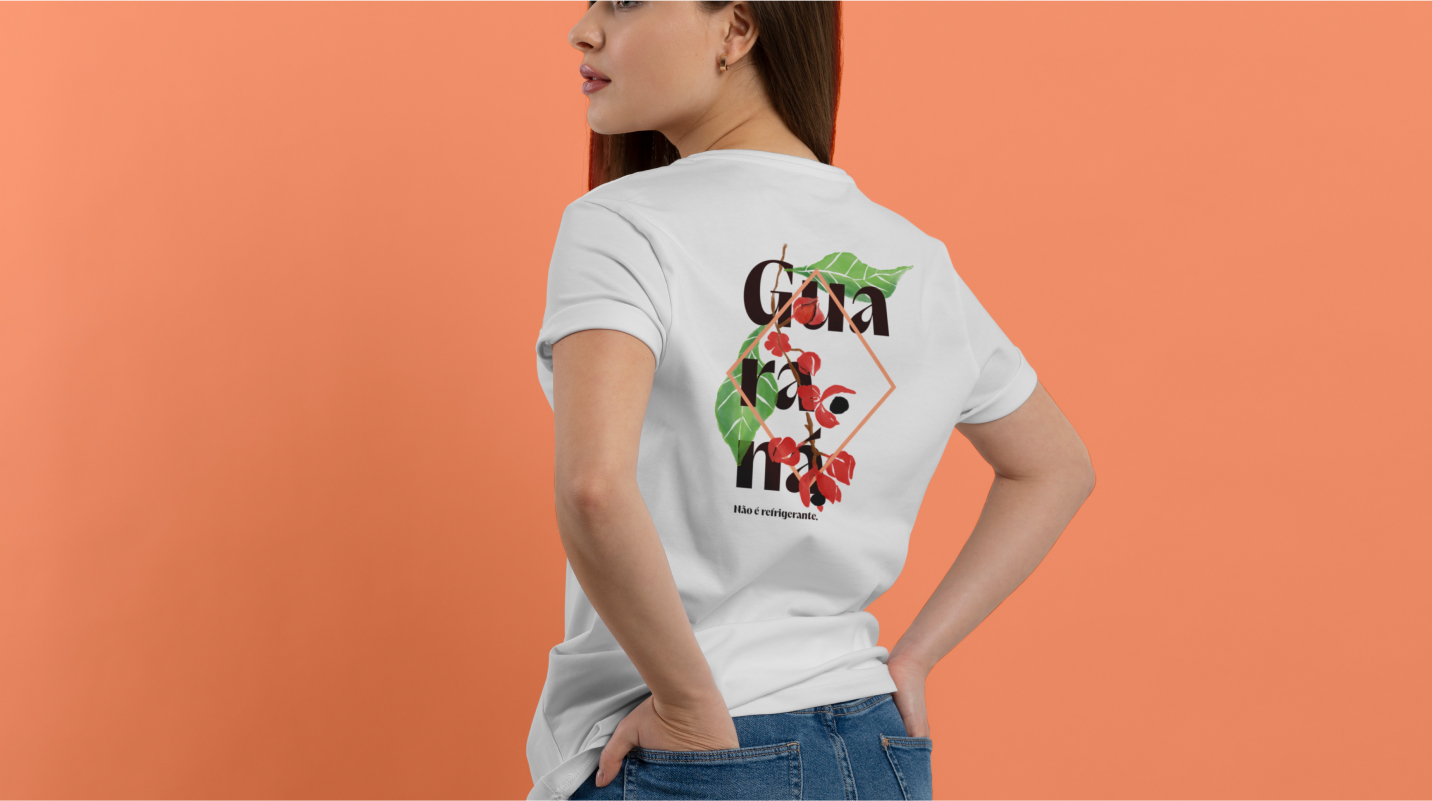
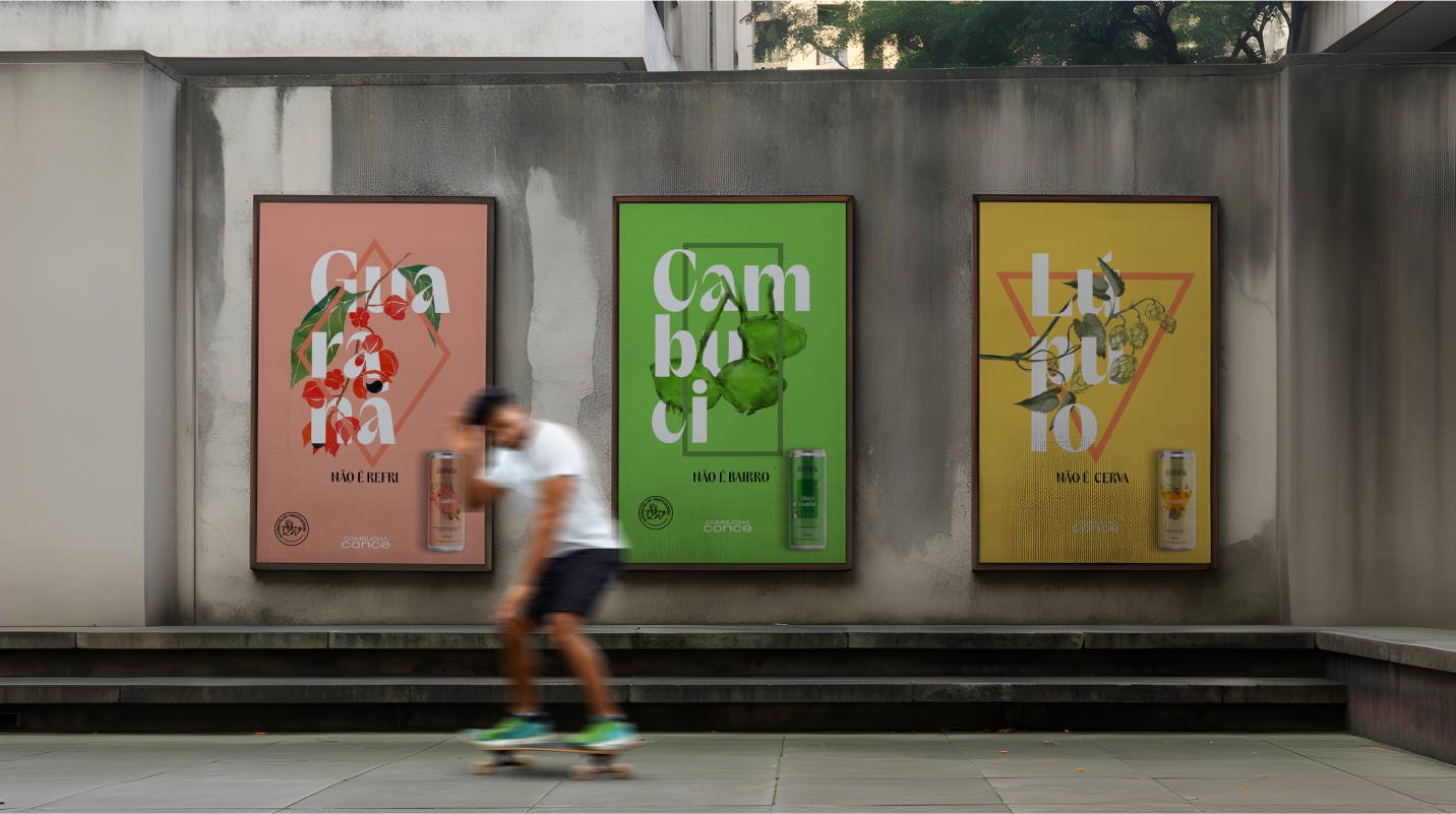
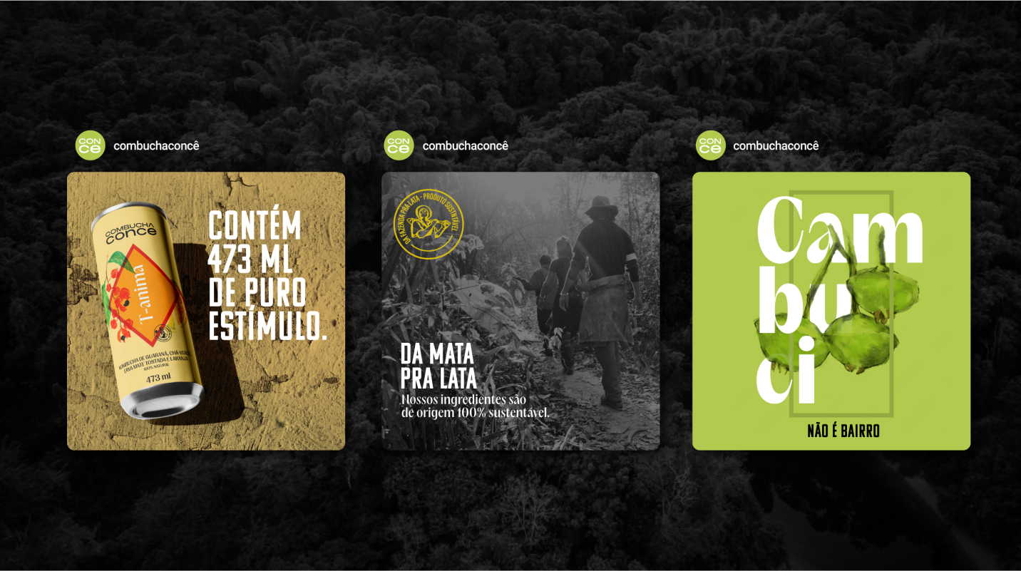
The graphics represent shapes based on city pillories, Brazilian characteristics and form windows that open and expand to show the unknown Brazil.
The geometric typography brings the characteristics of a perennial brand, while the irreverence of the name stands out, where the letter "A" of Combucha itself becomes the accent.
Next Cases

