Reshaping the
future of
refractories
by changing the way people see
them
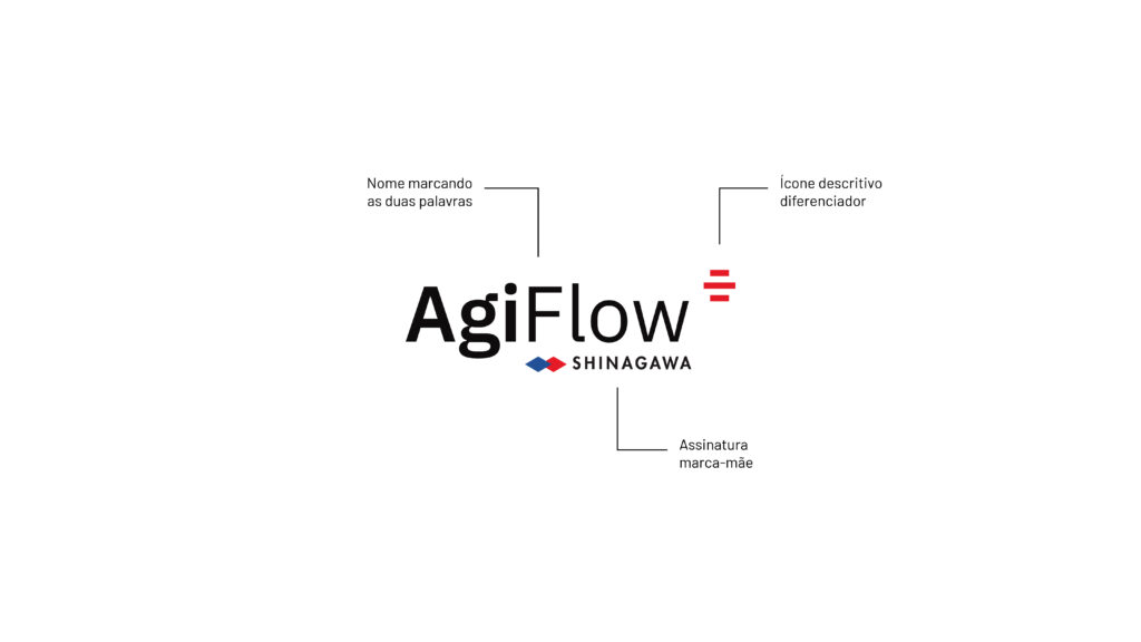
Shinagawa Refractories é uma das 3 maiores empresas do setor no mundo. Em um setor acostumado a identificar produtos por códigos sem significado e impessoais encontramos a oportunidade de diferenciação através de uma abordagem que equilibrasse Inovação e Acessibilidade.
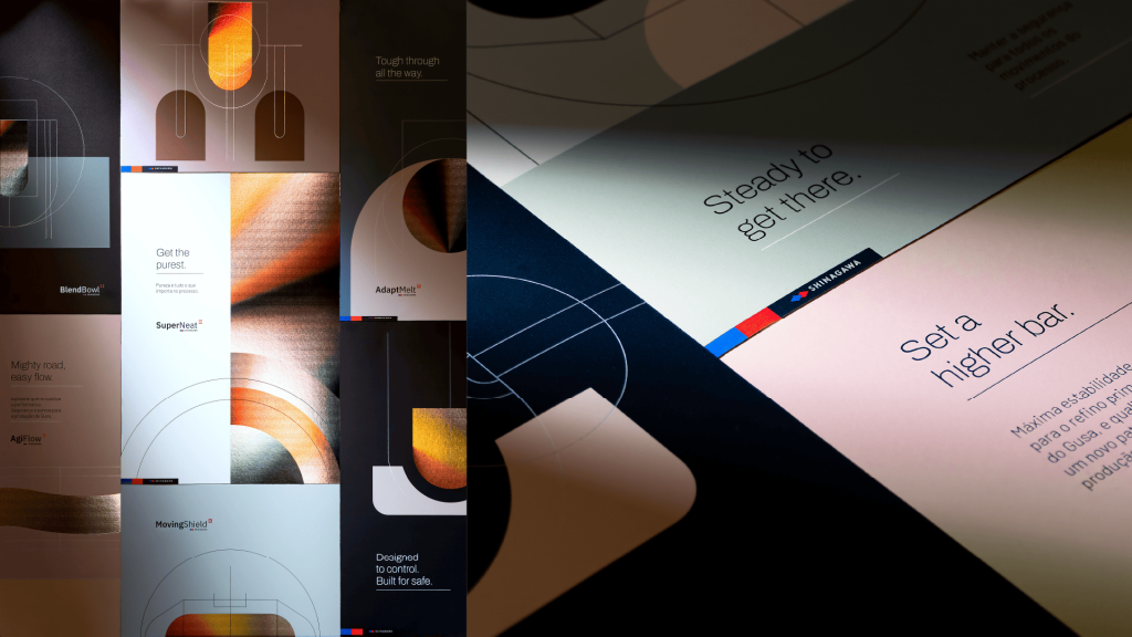
Enredo carried out in-depth research involving different audiences, from buyers to product operators. Based on these insights, we reorganized the product offering, simplifying the message and amplifying recall.
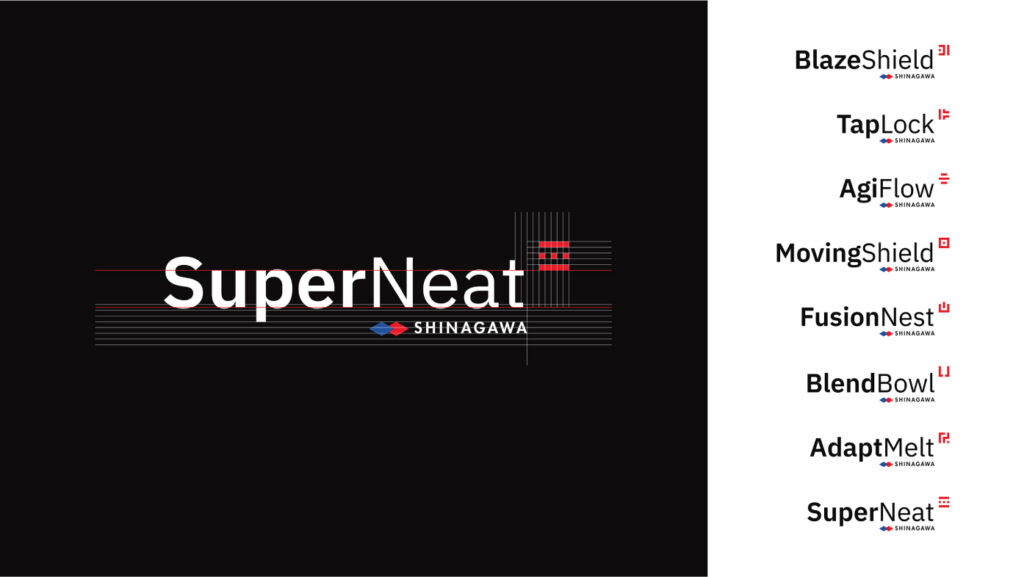
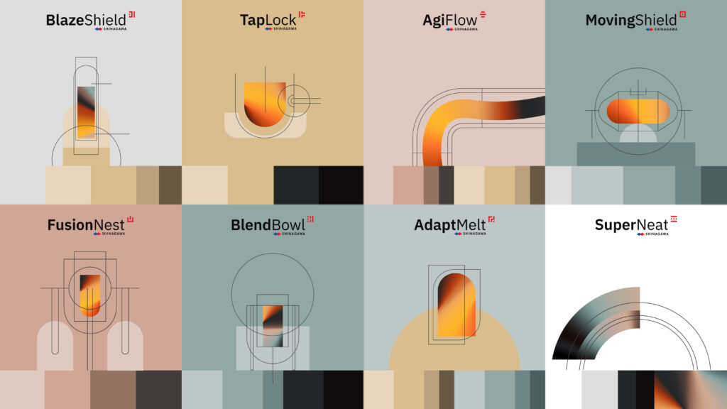
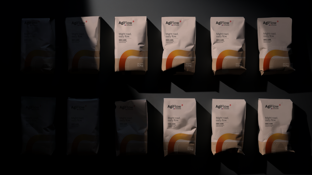
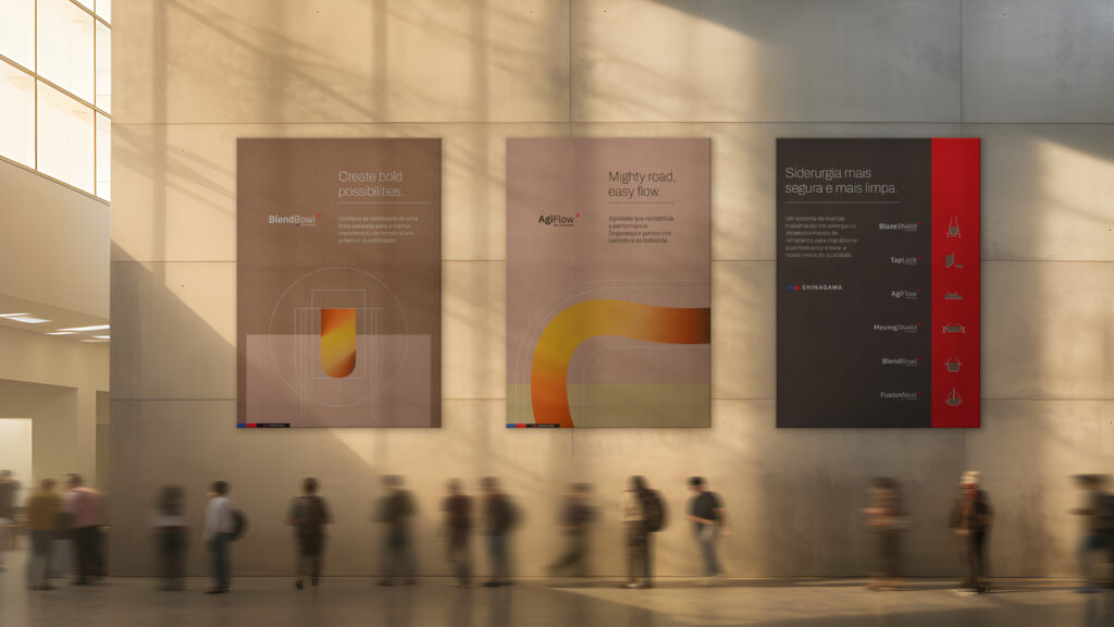
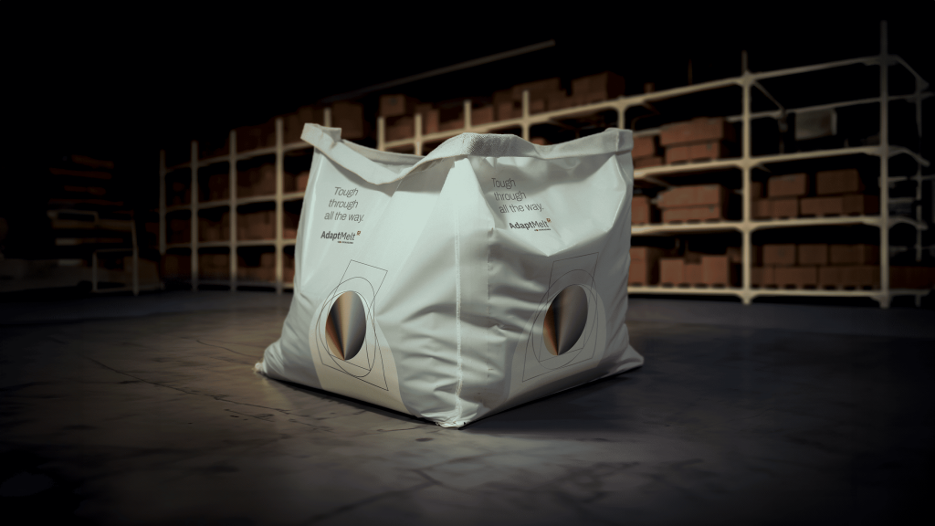
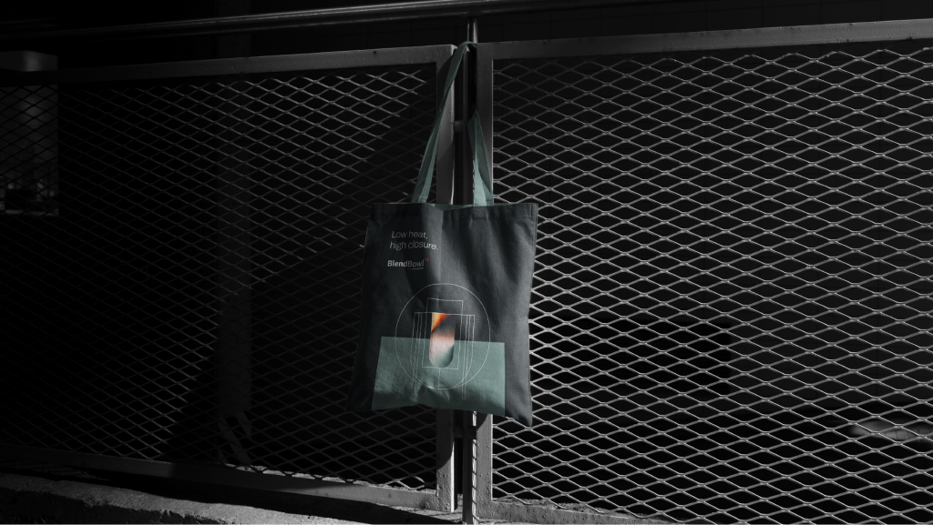
The result was the creation of 8 product lines with names that emphasized their functional and emotional benefits, making it easier to understand and interact with customers.
Culture
Japanese as
inspiration
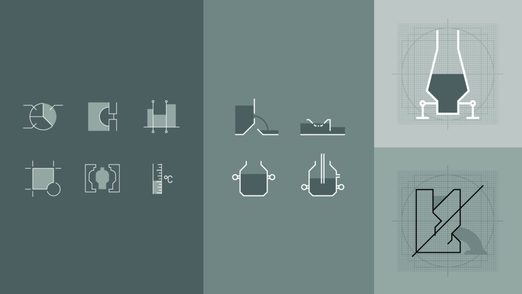
Inspired by the Japanese calligraphy technique Shodō, we created proprietary symbols for each of the 8 brands, making direct reference to the equipment to be used and the tangible functional benefit of the product.
By creating the Kanjis themselves, the design not only honored Shinagawa's cultural heritage, but also introduced an intuitive visual language unique to the market, raising the standard of communication in the industry.
Impact and
Results
global
Shinagawa's transformation has had a direct impact on the perception of its products, which have come to occupy the status of brands in the midst of commodities.
By bringing coherence and differentiation, the strategy adopted significantly increased the company's recall in the market, reduced communication costs and increased the power of the message.
In 2024 the project will begin to be replicated globally, starting in Japan, as a result of its efficiency.

Next Cases


