Diagnosis
brand
We identified that Casa do Pica-Pau was organized into 3 segments (agribusiness, business and John Deere representation) which allowed it to be a strong and regionally recognized brand, but made it difficult for the external public to understand the full range of activities.
We carried out in-store immersions and applied our own methodology through the Branding and Retail Architecture areas to present a plan of solutions: embracing the diversity of products to strengthen the positioning as an agricultural and business partner, integrating John Deere as a complementary brand in sales and recreating the in-store experience.


Strategy and
Identity
Based on the brand's differential, our purpose is to be the best partner for those who live and breathe agribusiness. A growing brand, dedicated to making others grow.
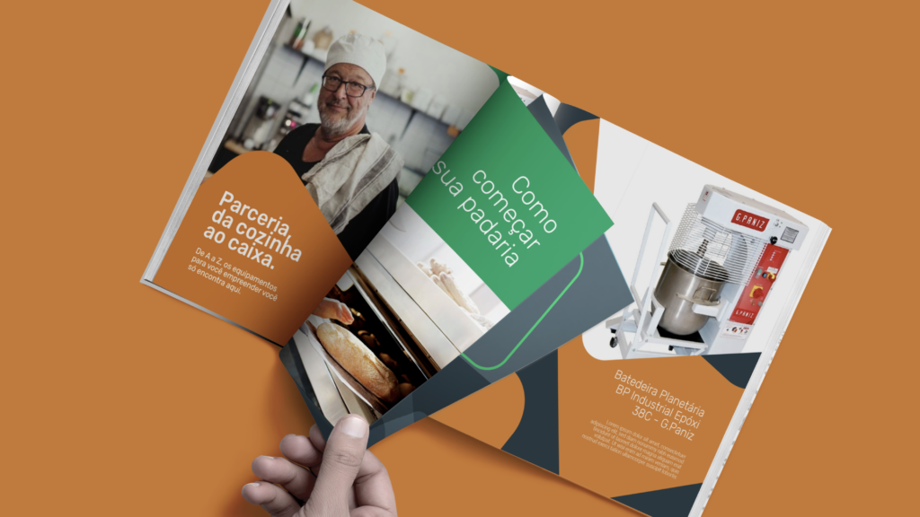
We expressed this change by updating the logo to a rounded and friendly typeface, modernizing the visual presentation. We created illustrations depicting scenes from agriculture and the business, with bright colors that support the division of segments.


Architecture
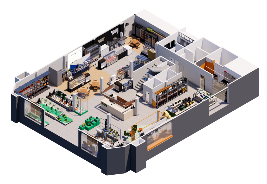
In line with the brand's new momentum, our architecture team restructured new stores for Casa do Pica-Pau in sizes P, M and G in order to give more flexibility and maintain the brand's standard in any available space.
As we immersed ourselves in the project, we identified two major challenges: to create a layout that emphasized products of varying sizes and a clearer, more agile and guided purchasing journey.
Point of sale strategy
We started by changing the categories to organize them by products in use. We then developed modular pallet structures that allow us the freedom to set up the store according to our needs at any given time.
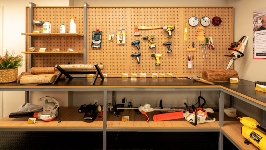
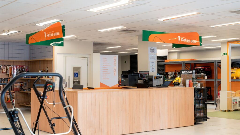
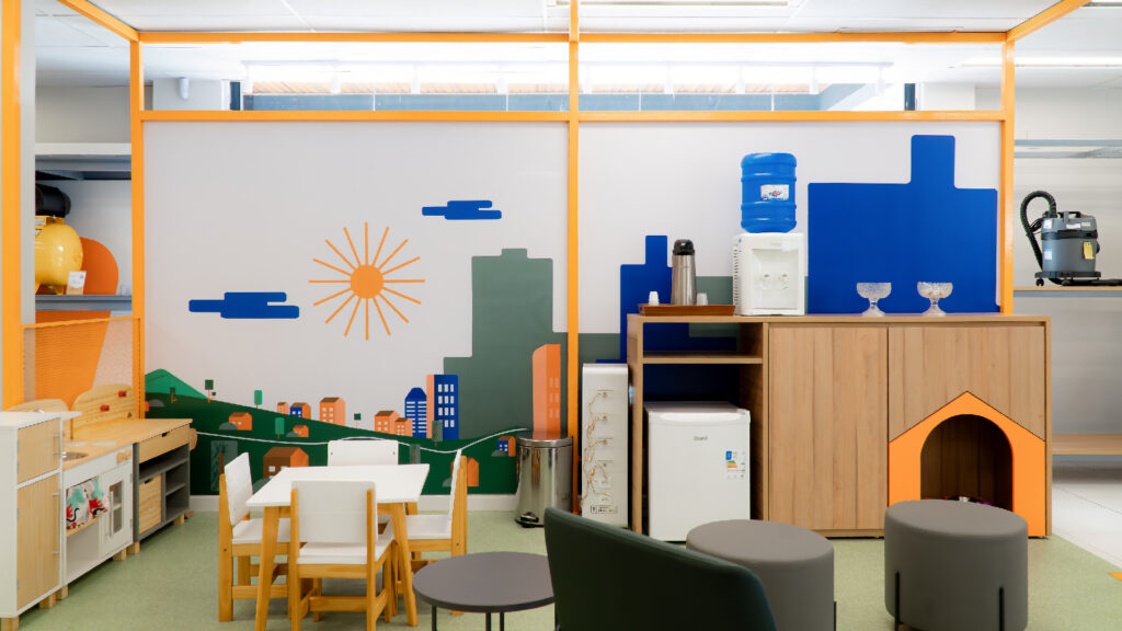
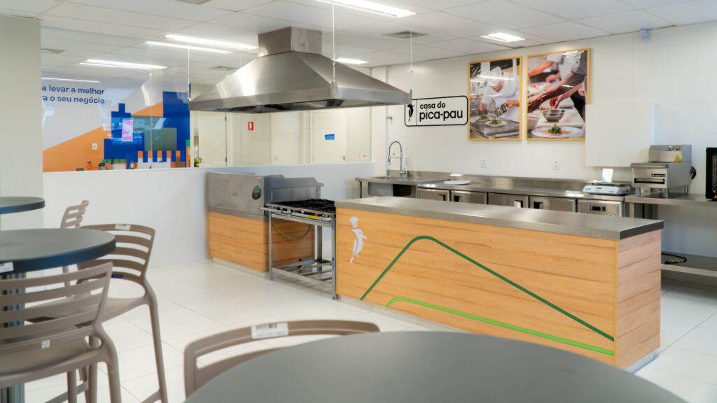
We designed a multi-channel shopping journey that reduces customer service times, provides spaces for testing equipment, hot spots that simulate real businesses, as well as pet-friendly spaces and an environment for children. More than a shopping space, Casa do Pica-Pau has become an experience space.
Next Cases


