A premium bank for everyone who needs it
Vanto is a private bank that wants to give everyone the power of money. Vanto came to Enredo with the challenge of creating a brand aimed at the C, D and E classes, an audience commonly ignored by traditional financial institutions.
We needed to build the perception of a premium bank for everyone, which reflects the size and importance of a healthy financial life.
The name is based on two essential guidelines: to provide advantages and to indicate a new step. Vanto not only reflects the mission of offering benefits to customers, but also evokes the idea of ascension and progress, fundamental elements of the brand's identity.



Approximate by simplifying
The visual identity was strategically designed to convey the idea of ascension and the conquest of financial power.
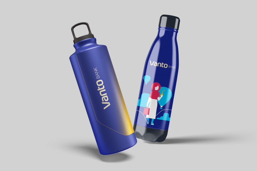
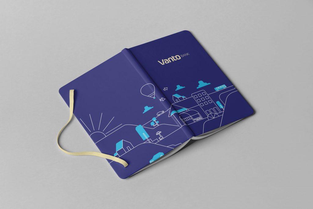
The dynamic graphic elements, such as diagonals and gradients, bring movement and sophistication to the pieces, while the contextualized illustrations reinforce the brand's message in a dynamic and engaging way.
The color palette, balancing sober shades of blue with the warmth of yellow, creates an atmosphere that combines seriousness with a warm and approachable approach.

Next Cases

