Over the course of almost 30 years, Luztol has built up a solid track record, offering a diversified portfolio of products to the regional and national markets. What began as a thinner and solvent factory has become a consolidated brand, recognized for manufacturing and distributing synthetic enamels, waterproofing resins, industrial and acrylic paints, textured coatings, among others.
This evolution was marked by challenges and transformations, and to sustain this growth it was essential to understand the brand's behavior in a competitive market, analyze the positioning of competitors and, above all, explore the public's perceptions of the sector.
The analysis and diagnosis we carried out revealed the foundations built up by Luztol over the years. And one of our main insights was the need to go beyond the technical qualities of the products, expanding communication to enhance the relationship with the public.
“High coverage and performance is just the start of the conversation.“
According to a recent study by Nielsen, which interviewed more than 40,000 consumers on all continents, 88% of consumers trust recommendations from acquaintances more than any other advertising medium. This preference highlights the desire for more human and authentic connections, motivating brands from different sectors to foster a sense of belonging and form communities around their value propositions.
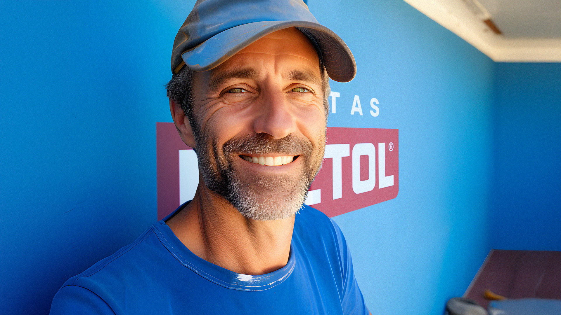
During the strategic development of Luztol's rebranding, we highlighted painters as central figures in the communication. Recognizing their importance, the brand already carried out actions aimed at professional training, helping to raise standards in the market. So, as part of the strategy, we reinforced this proximity, adjusting the brand's points of contact to reflect a more direct, genuine and versatile dialog, aligned with the commitment to the evolution of products, processes and partnerships.
“We've evolved our products.
In processes. In partnerships."
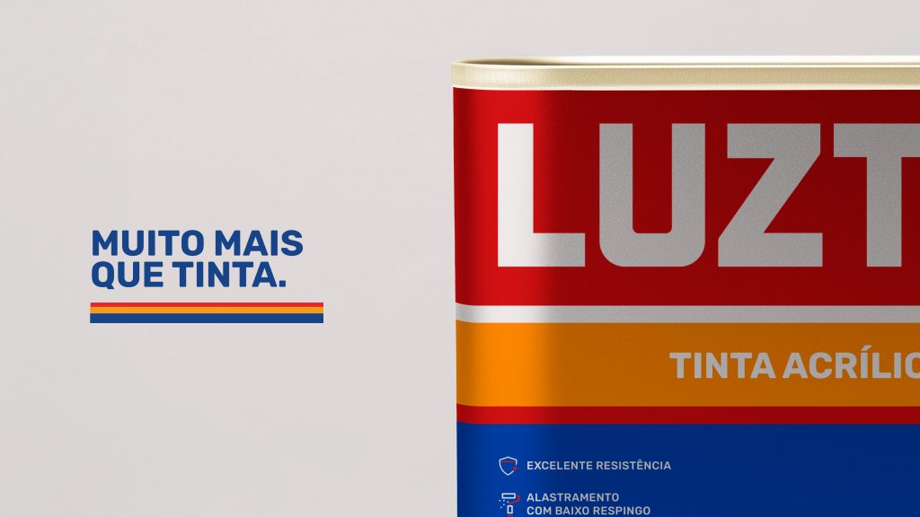
The verbal identity was revamped to adopt a more direct and personal tone, being helpful and authentic in every interaction, regardless of the moment or the public's need. In the visual field, the brand has also followed this evolution, updating graphic elements to convey modernity and accessibility. The logo has been given cleaner, rounder lines, the color palette has been intensified, and the graphics, inspired by the movement of brushstrokes, bring dynamism and closeness.
The photographs now highlight what really matters: people. Moments of conviviality and transformation in spaces revitalized by Luztol show the painter as the central figure, emphasizing his trajectory of personal and professional growth.
As catalysts for this movement, we went beyond diagnosis. We acted as strategic partners to help Luztol reframe its communication and reposition its brand. These changes reaffirm the commitment to excellence and consolidate Luztol as a brand that transforms lives and environments, putting people at the center of its story.